EEES4980/6980 Poster Tips March 2/04
Tim Fisher is author of this essay
Overview/ Purpose
The title of a poster should state the conclusion of the investigation rather than the process of what was done
The poster should deliver a clear message that is highly visual. A Poster presentation should have a visual impact
SIMPLICITY IS THE KEY. Keep to the point, and don't try to cover too many things. Present only enough data to support your conclusions. On the other hand, make sure that you present sufficient data to support your conclusions.
Before the poster session, rehearse a brief summary of your project. Many viewers will be in a hurry and will want a quick "guided tour" of your poster. Don't be afraid to point out uncertainties in your work; this is where you may get useful feedback.
Design the poster to address one central question. State the question clearly in the poster, then use your discussion time with individuals to expand or expound upon issues surrounding that central theme.
Planning
Know the size of the board available
Posters should be self-explanatory even in the absence of the author. Use simple figures and add color for emphasis.
Posters should stimulate discussion, not give a long presentation. Therefore, keep text to a minimum, emphasize graphics, and make sure every item in your poster is necessary.
Draw a rough sketch of your poster first.
You may find it helpful to use graph paper and small pieces of paper (e.g. Post-it® Notes cut to size) to better visualize where the components of your poster will go.
When you begin to make your poster, first create a list of the visuals that you would use if you were describing your project with only the visuals. Write the text after you have created the list of visuals.
Resist the temptation to overload the poster. More material may mean less communication.
Since a poster is essentially a visual presentation, try to find ways to show what was done - use schematic diagrams, arrows, and other strategies to direct the visual attention of the viewer, rather than explaining it all using text alone.
The main title should make people want to read the poster.
Use graphs, tables, or photos to grab attention and give info. (most of the information should be included in these
Keep the material simple and don't clutter the page.
Make full use of the space but you don't have to use every inch of space available. Use borders or space to separate the key poster contents
Remember that the objective of a poster is to show results of your work, not explain every little detail. Present specific examples but not too much information
General poster ambiance/Flow of information
Be concise and selective when showing results.
Space your information proportionally: divide your poster either horizontally or vertically into three or four sections, and place your materials within those spaces.
In a room full of posters, consider the visual impact your presentation needs to make in order to attract readers. Everything should be legible from three feet. Use colored mounting paper behind panels to increase to increase contrast and impact, but avoid fluorescent papers which will make things hard to read when someone gets closer.
Stick to a theme of 2-3 colors, no more.
Make sure your presentation flows in a logical sequence. It should have an introduction, body and conclusion, just like any other presentation. Arrange it ahead of time to make sure it fits the space provided. It will take longer than you think to cut mats and put things together. It is also a good idea to bring along some extra push pins and a sign up sheet or envelope for people to request copies of your information.
At first glance from 10 - 15 feet away the viewer should see an easy-to-read title and an uncluttered, neat arrangement of photos and/or illustrations and text. It should be obvious where to start inspecting the poster and where to go from there (generally left to right, top to bottom). As this progression is vital, the component parts should either be numbered to facilitate this or have arrows that graphically lead the viewer through the display
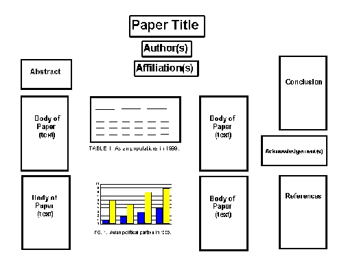
The heading should include the authors' names and affiliations
Sections should be arranged so the information "flows" smoothly.
Organization of the poster elements should appear smooth and flow logically.
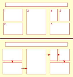
Figure 1. Two methods of leading the viewer through a poster: numbers, arrows.
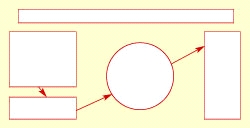
Figure 2. Attention-getting curved shape and lines.
Graphics
Description of and conclusion to graphics should be in a legend. This makes it more readable than if it were all in the text.
Materials must be easily read at a distance of 4 feet. Ordinary type or carelessly prepared handwritten copy is unacceptable. As a rule of thumb, use a font size of at least 14 point and double space.
Place related materials (e.g. photo with accompanying text) close together, then highlight it by framing with blank space.
When choosing a background, remember that neutral or gray colors will be easier on the eyes than a bright color. In addition, color photos look best when mounted on gray.
Most data are best represented with figures rather than tables. If you use tables, they should include no extraneous information.
Text
The abstract ideally should be between 200-300 words.
Text should be large - at least 36 point for title panels; 24 point for text.
Type should be in upper and lower case in a sans serif face (e.g., Arial) that is clear, precise and modes
As a rule of thumb, use a font size of at least 14 point and double space.
Choose a simple font such as Times, Helvetica or Prestige Elite and stick with it. Avoid overuse of outlining and shadowing, it can be distracting. To make something stand out, use a larger font size, bold or underline instead.
When text is used, it should be legible from 2 meters away. The newspaper format is highly "readable", two vertical columns arranged so that the left column is read first and then the right one.
The title should be in very large type, 84 pt or larger. Your name and school should also be noted in large type, consider 72 pt. Headings and sub-headings should be at least 36 pt. You need not use all capitals for titles and headings, it can sometimes make them harder to read.
Use the following MINIMUM font sizes: Title 84 pt, Authors and addresses 42 pt, Section headings 30 pt, Text 24 pt.
URL’s
http://www.ncsu.edu/project/posters/create.html
Return to Digital Graphics page